After the vote …
Whoever takes on the mantle of Health Minister in the 46th Federal Parliament will have a full reform agenda to prosecute.
The return of the incumbent LNP means Budget 2019/20, as presented in early April, should be rolled out. In terms of health, the focus was on continuing initiatives to progress the four pillars* of the Coalition’s ‘Long Term National Health Plan’.
- Guaranteeing Medicare and Access to Medicines [MBS and PBS]
- Supporting our Hospitals [State funding]
- Prioritising Mental Health, Preventive Health and Sport
- Investing in Health and Medical Research [Medical Research Future Fund].
The development of the Long Term National Health Plan had been announced two years earlier by the Hon. Greg Hunt, who was at the time relatively new to the Health portfolio. The announcement was preceded by focused activity to sign compacts with potentially vocal and volatile stakeholders. These compacts and other relevant agreements due for re-negotiation are listed in the table.
| Agreement / Compact | Other Party (ies) | End date | Key Purpose |
| National Health Reform Agreement (and Addendum) | COAG States and Territories | 30 June 2020 | Public hospital fundingHealth Care Home (HCH) model |
| Community Pharmacy Agreement (6CPA) | Pharmacy Guild | 30 June 2020 | Community Pharmacist renumeration; Wholesaler payments; funding for community pharmacy programmes, Pharmacy Location Rules |
| Compact: A Shared Vision for Australia’s Health System | AMA | 2020-21 (period of forward estimates from 2017-18 budget) | Early resumption of MBS indexation; reversal of bulk billing incentives for pathology and diagnostic imaging; MBS review; My Health Record uptake; Health Care Homes |
| Compact: Strengthening Medicare | RACGPs | 2020-21 (period of forward estimates from 2017-18 budget) | Early resumption of MBS indexation; MBS review process; after-hours MBS items; workforce reform; My Health Record uptake |
| Strategic Agreement | MA | 30 June 2022 | Delivery of $1.8 billion in savingsPBS process improvements |
| Strategic AgreementCompact: Strengthening PBS-Measures to Support Generic and Biosimilar Medicines Uptake (2-year extension) | GBMA | 30 June 2022 | greater certainty of Government pricing policies for F2 Formulary medicines with brand competition, in an environment of ongoing medicine price reductions associated with price disclosure |
The compacts were said to be a platform for the national plan and ‘underpinned by a range of shared principles …, transparency in decision making, accountability for reforms, stability and certainty in regards to Government investment‘.
The ultimate success of this approach was reflected in how health was debated equally alongside the other common issues important to Australians in the lead up to yesterday’s election (no controversy, unlike Mediscare in 2016).
The roll-out of the National Plan reforms is scheduled in 3 waves:
- Wave 1: guaranteeing Medicare, agreement by COAG on a opt-out model for My Health Record and investments in mental health psycho-social support;
- Wave 2: sustainability and affordability of private health insurance, mental health particularly in rural areas, workforce strategy, aged care reform; and
- Wave 3: reform of public hospitals and post 2020 agreements with the states, primary health care and preventive care.
Activity appears to have been well progressed into Wave 2 when the election was called.
Wave 1 was said to be ‘underpinned by the 5 major compacts with medical and industry bodies’. The next Federal Minister of Health will be in demand by these bodies as the compacts (and agreements) come up for review.
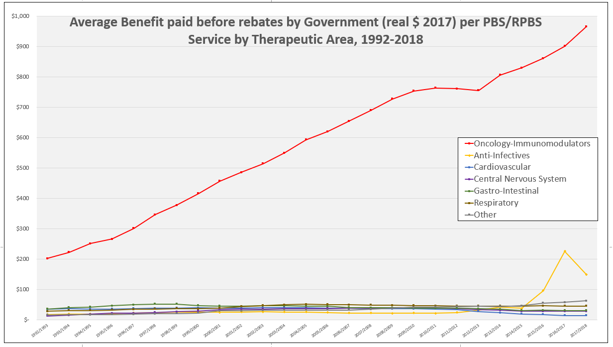
*Note: Aged Care was also specifically addressed by the 2019/20 Budget in the environment of an ongoing Royal Commission.