PBS Top 10

NPS MedicineWise has published* the Top 10 drugs for the financial year July 2017 to  June 2018 based on PBS and RPBS prescriptions. The data is based on date of supply of all prescriptions including those under the co-payment, sourced from the Department of Health in October 2018.

The top 10 medicines by cost to government are single originator brand products from the F1 formulary that, at the time of PBS listing, represented breakthrough innovations in their therapeutic area. Specifically, in the treatment of hepatitis C, macular degeneration and solid tumours. Overall, the ten represent 23% of government expenditure on the PBS and less than 1% of prescription volume.

Gilead’s Epclusa®, Harvoni® and Solvadi® occupy first, fourth and seventh place, respectively. These  account for almost 10% ($1.15 billion) of expenditure according to the data. However, rebates are not included and hence the real value that the Government place on this scientific breakthrough, on behalf of Australians, is unclear. The confidential nature of the effective price means it can be assumed that it is less than what governments and patients are prepared to pay elsewhere.

Anti-neoplastic and immunomodulating agents in the top 10 account for 7.3% of spend with AbbVie’s Humira®; Roche’s Herceptin® and the more recent checkpoint inhibitors, Opdivo® (BMS) and Keytruda® (MSD) represented. The top 10 for cost to government is rounded out by Bayer and Novartis with their macular degeneration treatments, Eylea® and Lucentis®, respectively. Xgeva® (Amgen) for bone mineral density is included at #8.

It must be assumed that risk share and/or special pricing arrangements are in place for all of these products. Thus the dollar values listed are likely to include rebate and cap re-payments that contribute to the PBS drug recoveries figure of $2.36 billion in the Department of Health Annual Report 2017-18.

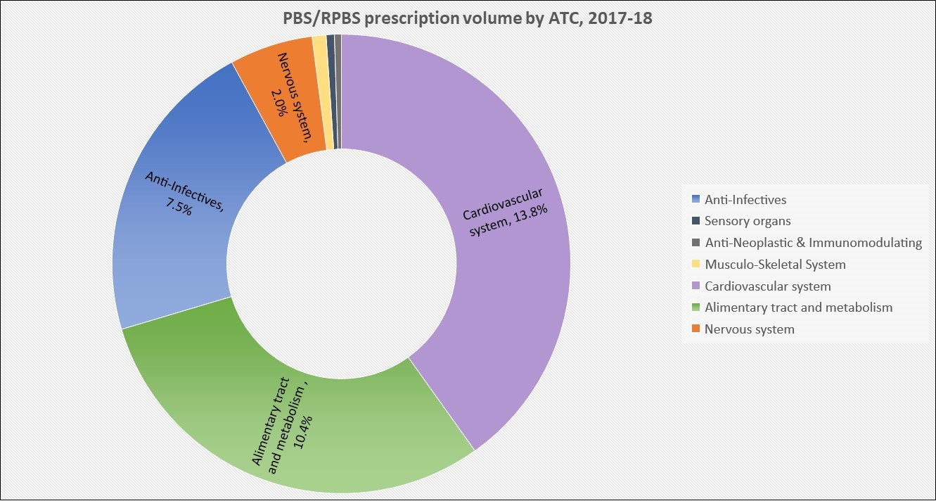
Not surprisingly, the top 10 medicines by prescription volume all hail from the F2 formulary with multiple brands available. Cardiovascular treatments for cholesterol (rosuvastatin and atorvastatin) and blood pressure (perindopril) account for almost 14% of scripts dispensed. This is followed by protein pump inhibitors (esomeprazole and pantoprazole) for GORD and ulcers with 8% of volume. The  ‘overprescribed’ anti-infectives cefalexin, amoxicillin and amoxicillin with clavulanic acid, represented 7.5% of all prescriptions supplied in 2017-18. Metformin for Type 2 diabetes and escitalopram for depression and anxiety are # 8 and #10, respectively.

Source: Australian Prescriber* and Medicare Australia Statistics

The top 10 for defined daily dose (DDD) per thousand population per day is also included in the article and is suggested as a more useful measure of drug utilisation than prescription counts. It shows how many people in every thousand Australians are taking the standard dose of a drug every day. The list includes eight products for treatment of chronic cardiovascular disease (atorvastatin, rosuvastatin, perindopril, amlodipine, irbesartan, candesartan, telmisartan and  ramipril). Esomeprazole and metformin complete the ten.

*Australian Prescriber 2018;41:1943 Dec 2018 DOI: 10.18773/austprescr.2018.067

Image source

Health Data Snapshot, Part 3

A treasure trove of health data by location is available on-line. 

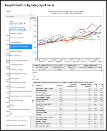
HealthStats NSW contains up-to-date information on over 200 health risk factors, diseases, locations, and specific populations within New South Wales. The flexibility and power of this resource is reflected in the snapshot of Hospitalisations by category of cause.  The blurry graph shows a time-series comparison by Primary Health Network and all NSW for ‘blood and autoimmune disorders’.  The data table is a click away below, the top down menu shows the other therapeutic categories that can be selected. Behind the drop-down are further choices based upon demographics, Aboriginal and Torres Strait Islander (ATSI) background and/or socioeconomic status.

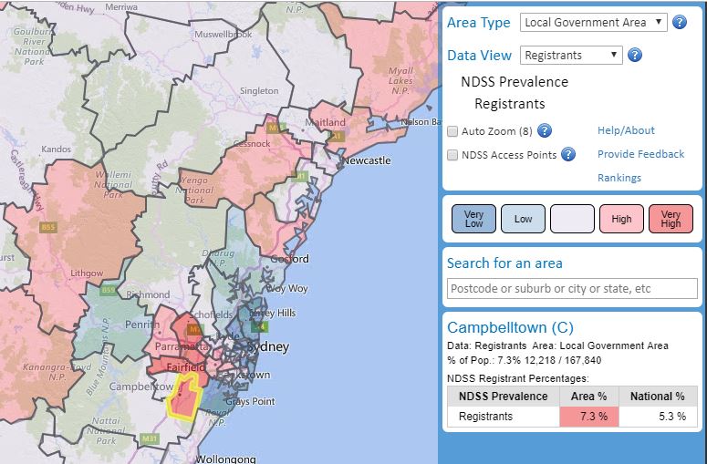
The National Diabetes Supply Scheme provides an on-line mapping tool of registrants by various geographical locations. This can also be filtered further by diabetes type, age, gender, ATSI and socioeconomic status. The example shown is for the Local Government Area of Campbelltown in NSW where the estimated prevalence of diabetes is 7.3% of the population, which is classified as very high comparative to the national average rate of 5.3%.


In addition to these interactive, web-based applications, reports collating specific data are starting to be published. Most recently, the AIHW released Potentially preventable hospitalisations in Australia by small geographic areas.  This report provides information on 22 chronic, acute and vaccine-preventable conditions for which hospitalisation may have been avoided by the provision of timely and appropriate health care. Even though these reports usually contain data already available publicly, it is often cross-tabbed to provide different perspectives, and the quality of an AIHW analysis is assured.


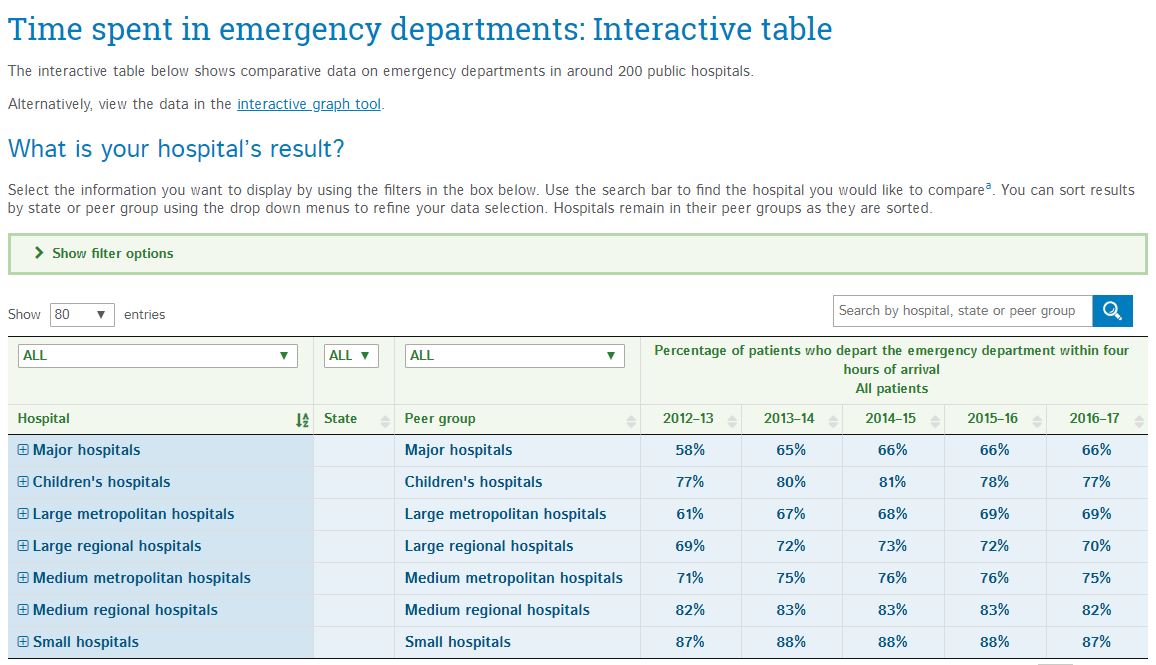
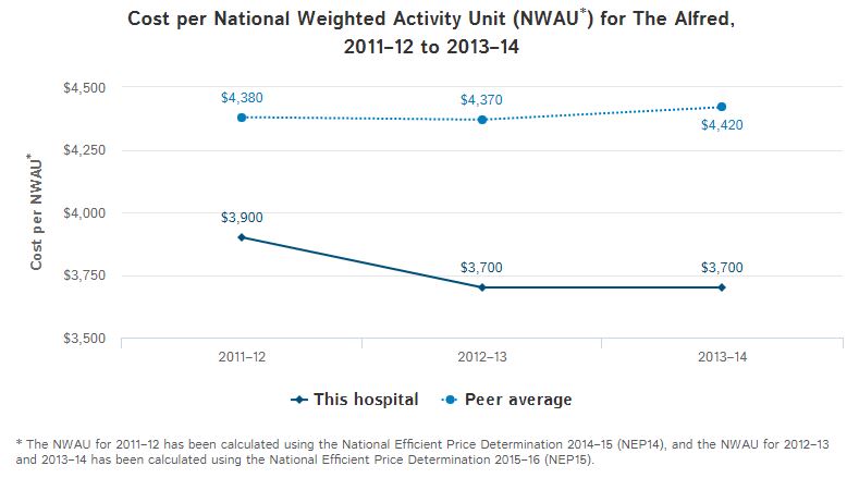
As the MyHealthyCommunities website is to national and localised primary healthcare data, then the MyHospitals website is to hospitals data. The site, established by the AIHW in 2010, includes data for over 1,000 public and private hospitals nationally. Hospitals can be searched for by state or postcode. Individual hospital profiles, services, and performance indicators can be viewed and compared to other hospitals. Information can be presented as a data table, such as the Waiting Time in Emergency Departments by hospital type shown (above), or graphically such as the financial efficiency data (activity based funding) presented for The Alfred, Melbourne (below). The site includes an explanatory videos and notes to assist in interpretation of information provided.

Graphic source: http://fchd.org/Clinic/CountyHealthData.aspx

Health Data Snapshot, Part 2

In Part 1, geographical classifications available for collation and reporting of health data were discussed.

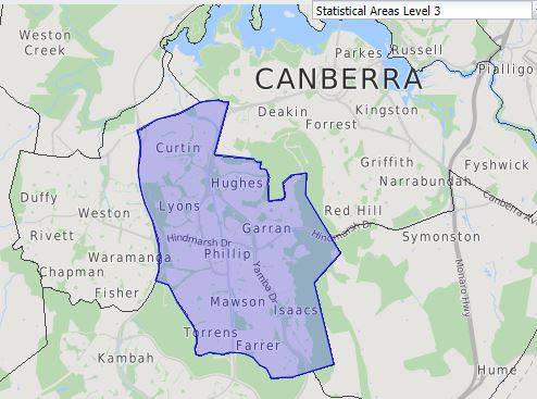
The demographic characteristics of a population are generally presented before moving into health statistics. The ABS Census of Population and Housing Data includes this information and is available by geography online for the past 4 surveys (2016, 2011, 2006, 2001). The 2016 Census for ABS Statistical Area 3 for Woden Valley in Canberra, Australian Capital Territory (ACT), the location of the Department of Health is shown. ‘Quick Statistics’ provide a one page (scroll down) summary for the approximately 35,000 residents in a table format, and a side by side comparison of each variable to that recorded for the 400,000 inhabitants of the ACT, and just over 24 million people in Australia. While 68% of the residents of the Woden Valley were born in Australia, 25% speak a language other than English at home.

A ‘General Community Profile’ is also generated and consists of an Excel workbook containing 60 spreadsheets of data for the area selected. A range of other Census data products are also free online, including Time Series Profiles across Censuses, DataPacks and TableBuilders.

The 5-yearly Census of Population and Housing data is used to generate the Socio-Economic Indexes for Areas (SEIFAs) which, as the name implies, rank areas in Australia according to relative socio-economic advantage and disadvantage. Each of the four indexes is a summary of a different subset of Census variables with a different focus:

  • Index of Relative Socio-economic Disadvantage (IRSD)
  • Index of Relative Socio-economic Advantage and Disadvantage (IRSAD)
  • Index of Economic Resources (IER)
  • Index of Education and Occupation (IEO)

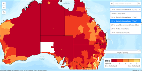
The website includes an interactive map for each index. If we enter Woden Valley ACT on the IRSD Interactive Map,  the SA3 geographic area is not available in the drop down menu. Our selection is limed to SA1, SA2, LGA, POA or SSC, however data cubes with results by decile are available for the wider range of geographic classifications.

Sixteen variables are used in the IRSD index. The percent of people with stated household equivalised income between $1 and $26,999 per year is the strongest indicator of disadvantage. Other associated factors include unemployment, lower levels of education attainment, no internet connection, no car, overcrowded private dwelling and poor English language skills.

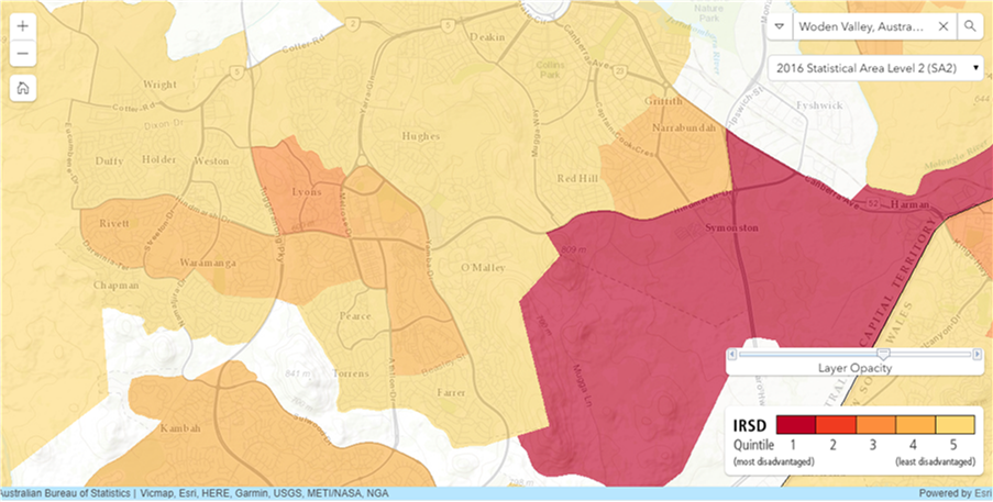
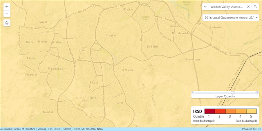
Unfortunately, the indexes are not foolproof. Selection of geographic area can impact the results as shown for Woden Valley,  where choice of SA2 displays pockets of Quintile 1, most disadvantaged through to Quintiles 3, 4 and 5, least disadvantaged (on the left) suggesting a different socio-economic situation than when Local Government Area is selected with all areas being displayed as Quintile 5, least disadvantaged (on the right). This re-enforces the need to compare like with like to ensure appropriate interpretation.


Source Tom Cruise meme: Google images (unfortunately, the link goes to one of those surveys)

Health Data Snapshot, Part 1

If you want to create a picture of the health status and needs of the residents in a particular Australian location, the first step is to define the area you are interested in. This seems pretty straightforward, until you start pulling out numbers…

Thanks to the Australian Bureau of Statistics, who developed the Australian Statistical Geography Standard (ASGS) in 1984, using the latest version from 2011, you can find statistics from different sources that apply to the same area, and hence, are comparable.  The power of this will become evident in Part 2, and saves a lot of time!

The ASGS is split into two parts. The basis for both are the smallest geographical area defined by the ABS, known as Mesh Blocks (MBs). They are geographic building blocks that take into account factors like suburb boundaries and land use. Most Mesh Blocks contain 30 to 60 homes. Mesh Blocks are updated every 5 years to reflect changes, such as new housing developments.

ABS Structures

These are areas that the ABS designs specifically for generating statistics. They also stay stable for 5 years to enable better comparison of data over time.

Statistical Areas Level 1 (SA1s) have an average population of approximately 400 persons. They aim to separate out areas with different geographic characteristics within Suburb and Locality boundaries. SA1s are aggregations of Mesh Blocks.

Statistical Area Level 2 (SA2s) reflect functional areas that represent a community that interacts together socially and economically. SA2s generally have an average population of about 10,000 persons. SA2s are aggregations of whole SA1s.

Statistical Areas Level 3 (SA3s) are designed for the output of regional data and generally have populations between 30,000 and 130,000 persons. SA3s are aggregations of whole SA2s.

Other classifications include SA4s for Labour Force Surveys; State and Territory and Australia for geographical purposes; and specific structures for Indigenous and Remoteness.


Non ABS Structures

As  the title would suggest, these are not defined by the ABS, however they are required to report statistics on them. These measures probably annoy purists within the ABS as they change regularly. For example, Local Government Areas (LGAs) are defined by State and Territory governments and updated annually. The diagram shows the eight Non-ABS structures that generally represent administrative regions and how the ABS approximates them using a construction of Mesh Blocks, SA1s or SA2s.

Diagram 2 depicts the various ASGS Non-ABS Strutcures, their component regions and how they interrelate.

In addition to Local Government Areas (LGAs), these include: Postal Areas (POAs); State Suburbs (SSCs); State Electoral Divisions (SEDs); and Commonwealth Electoral Divisions (CEDs), the later using the Australian Electoral Commission (AEC) federal electoral division boundaries constructed from allocations of one or more whole SA1s.

Non Non-ABS Structures

One to date: Primary Health Networks (PHN).

In Part 2, where and when to put these structures to use locating health data.

Visit the ABS website for further details. Photo source

Gut wrenching data

The newly released AIHW Report on Gastrointestinal Cancers is the first time Australia-wide data, specific to gastrointestinal-tract cancers, has been collated. It is the result of collaboration between the AIHW, all state and territory population-based cancer registries and Cancer Australia.

The report is a fantastic resource as it brings together epidemiological, diagnostic and treatment data in a comprehensive way thus providing a full picture for comparison and interpretation. The explanations regarding data sources in the appendices are also very helpful.

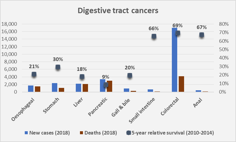
The eight upper and lower gastro-intestinal cancers included are shown in the graph below of cases diagnosed, deaths and relative 5-year survival rates.  Colorectal cancer is the most commonly diagnosed, a function of higher incidence and the National Bowel Cancer Screening Program (NBCSP), followed by pancreatic cancer as the second most commonly diagnosed.  These two cancer types are associated with the highest and lowest, 5-year relative survival rates of all gastrointestinal-tract cancers, at 69% and 9%, respectively.


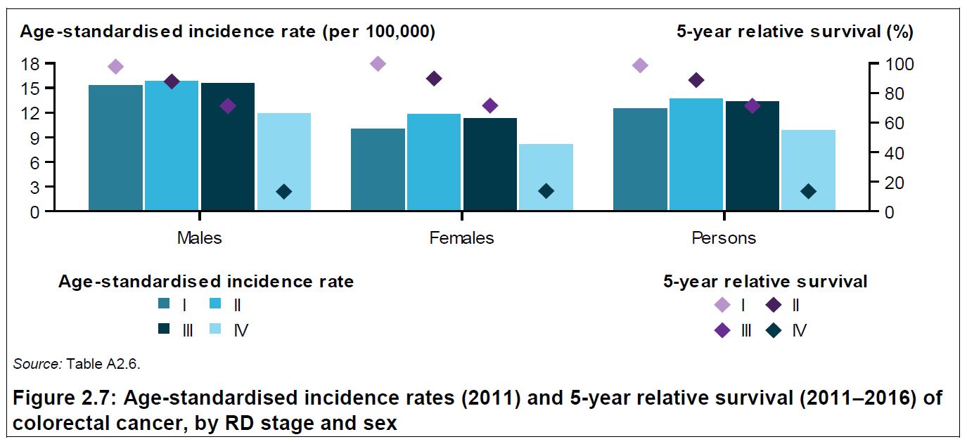
The inclusion of disease Stage at diagnosis enables presentation of data as shown below from the report. Cases of colorectal cancer diagnosed in 2011 and the 5-year relative survival for the period 2011-2016, both reported by disease Stage, clearly demonstrate the impact of early diagnosis on mortality. For people diagnosed with Stage I colorectal cancer, the 5-year survival rate was 99%. Delay diagnosis to Stage IV and this figure becomes 13%.


In 2016–17, the gastrointestinal-tract accounted for approximately 20% of cancer diagnoses, 18% of cancer-related hospitalisations and 27% of chemotherapy procedures in Australia. Further detail on the treatment used at which disease Stage, would be a valuable inclusion in the next iteration of this report.

The majority (92%) of the burden of gastrointestinal-tract cancer was due to premature death. The remainder was associated with diagnosis (such as  biopsy) and primary treatment of the cancer (for example, surgery which may include bowel resection). Long-term effects, such as the use of a stoma with a colostomy bag, also contributes to the non-fatal burden from colorectal cancer in the Australian population.

Picture source: ‘The Scream’ original and stylised

Advanced Therapy Medicinal Products (ATMPs)

Advanced Therapy Medicinal Products (ATMPs) encompass gene, somatic cell therapies and tissue-engineered products, as well as these in combination with a medical device. Refer to  classification decision tree of AMTPs for further detail.

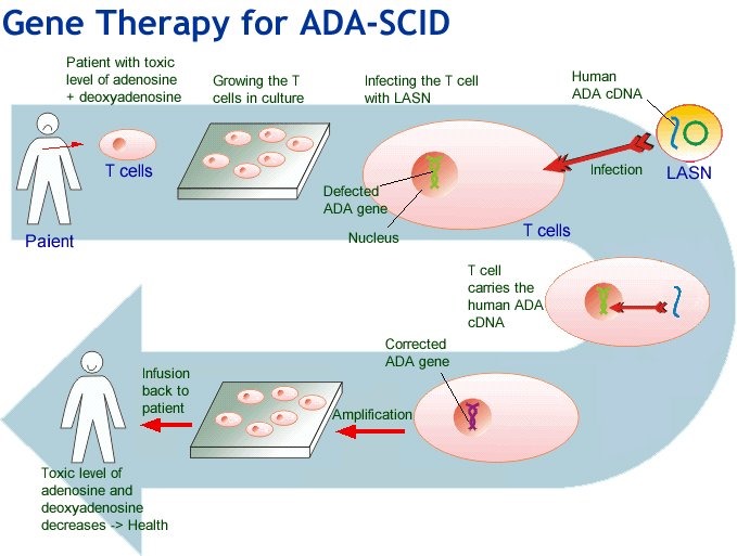
In general, these products involve replacement or regeneration of human cells, tissues or organs in the ultimate personalised medicine. Many also have the potential for a one-time cure. For example, GSK’s Strimvelis for treatment of adenosine deaminase deficiency–severe combined immunodeficiency (ADA–SCID), referred to as ‘bubble boy’ syndrome (below).

Regulation of ATMPs

The legal and regulatory framework for ATMPs in the European Union was formalised under Regulation (EC) No 1394/2007 over a decade ago. Since June 2009, the primary responsibility of the Committee for Advanced Therapies (CAT) is to assess the quality, safety and efficacy of ATMPs, and to follow scientific developments in the field on behalf of the European Medicines Agency. A summary of work to date is available in this presentation by the CAT Secretariat (May 2018).  New guidelines on GMP and GCP  for ATMPs have also been developed.

Meanwhile, the US FDA Center for Biologics Evaluation and Research (CBER) Office of Tissue and Advanced Therapies (OTAT, formerly known as the Office of Cellular, Tissue and Gene Therapies, or OCTGT) was renamed out of a restructure in 2016. In August 2017, the FDA Commissioner Scott Gottlieb, M.D. issued a statement on the agency’s new policy steps and enforcement efforts to ensure proper oversight of stem cell therapies and regenerative medicine. This has been followed by a further statement in July 2018 focused on gene therapies and ongoing releases of guidelines for consultation.

The International Pharmaceutical Regulators Forum’s (IPRF) currently has working groups for Gene Therapy and Cell Therapy to foster broad consultation and harmonisation. Identified challenges include the small quantities generated, often autologously, and short shelf-lives which do not fit with GMP principles. Similarly, without suitable animal models how is non-clinical testing to be performed, and does it need to be? Additionally, clinical trial design and data collection will require flexibility due to the rarity of most of the conditions being treated.

Reimbursement of ATMPs

In 2017, NICE commissioned a mock appraisal of ATMPs which concluded: ‘(1) the existing appraisal methods and decision framework were applicable to regenerative medicines; (2) quantification of decision uncertainty was key in decision-making; (3) where uncertainty is substantial, innovative payment mechanisms may play an important role and facilitate timely patient access; and (4) choice of discount rate is extremely important and can have an impact on the incremental cost-effectiveness ratio (ICER).‘ GSKs Strimvelis® received a positive NICE recommendation in October 2017 as an option for treating ADA–SCID when no suitable human leukocyte antigen-matched related stem cell donor is available. The cost at the time was Euro 594,000 (approximately AU$ 1 million) for the one-off treatment.

In a recent open access article, Jonsson and colleagues describe the convening of an Expert Panel to identify and discuss potential issues for ATMPs when evaluated using Health Technology Assessment (HTA) frameworks.  Identified challenges included clinical evidence generation, safety concerns, assessing and paying for value, uncertainty, affordability, and the manufacturing and organisation of service delivery. They prioritised three topics similar to those considered important by the NICE appraisal described above:

  1. Uncertainty – due to the nature of evidence likely to be available for ATMPs. Potential solutions posed include measuring survival separately for cured and non-cured patients. They reference an article by Othus et al. 2017  which uses this approach for ipilimumab in melanoma and reduces the ICER by a third. Collection of real world evidence and outcome based agreements, or leasing schemes are also discussed.
  2. Discounting – cost-effectiveness estimates for one-off treatments are sensitive to distribution of costs and benefits. ATMPs are likely to involve high treatment costs occurring years before all health benefits accrue, and it is this time period that is sensitive to discount rates and thus estimates of cost-effectiveness. They consider if specific discounting rules should apply to ATMPs reflecting on the opportunity cost of capital, time preference of stakeholders, and decreasing marginal utility of income and conclude that a lower discount rate should be used to support technologies with costs now and outcomes in the long-term, as well as benefiting future generations.
  3. Health outcomes and value when considering potential curative treatment for a few versus smaller incremental benefits for a much larger population. They discuss ‘priority setting’, how current HTA frameworks do not fully capture stakeholder values, QALYs and thresholds for decision making and limitations on how to account for other factors. They point out that ‘guidelines for reimbursement are silent about the role of empirical studies for assessing the value of specific products or classes of products from patients or the general public.’ Those who work in the HTA space know that other factors may also be relevant for payers, patients, and society in addition to health gain and health system costs.

The article concludes with recommendations as a means to initiate and continue discussion. Interestingly, the first four, of eight ATMPs currently EC-approved (ChondroCelect®, Glybera®, MACI®, Provenge®) have all been withdrawn from market for commercial reasons. After 15 years of research and development involving 500 patients, ChondroCelect® received marketing approval in the EU in 2009. It was voluntarily withdrawn by the sponsor in 2016.

The challenges faced by ATMPs include complex and expensive regulatory and manufacturing processes, small patient populations with limited clinical data, and the need for high upfront investment for a course of therapy that may only be a single treatment. As with current therapies for rare and ultra-rare diseases, how society can provide equitable patient access at the same time as commercial returns will be an ongoing debate.

Sources: AT-MP; Flow diagram

Visualisation of Health Expenditure data

The Australian Institute of Health and Welfare (AIHW) report on national health expenditure for the financial year 2016-17 was released last week. The usual on-line and pdf versions are available and the information can also be viewed using a data visualisation tool.

The tool accesses the AIHW Expenditure Database from 1996 through to 2016. Note: these years refer to financial years (the full year covered appears when the cursor is hovered over a data point on graphs produced).

The choice of presentation in constant or current dollars is important when assessing trends. Current prices are the actual amounts spent in the specified year. These will match the dollar amounts in the published reports, however they are not adjusted for inflation. Any comparisons made over different time periods require the use of constant prices that have been ‘deflated’ to a selected reference year. The tool uses the most recent data presented as the reference year. Growth in expenditure when expressed in constant prices is termed ‘real growth’ as opposed to ‘nominal growth’ when current prices are used.

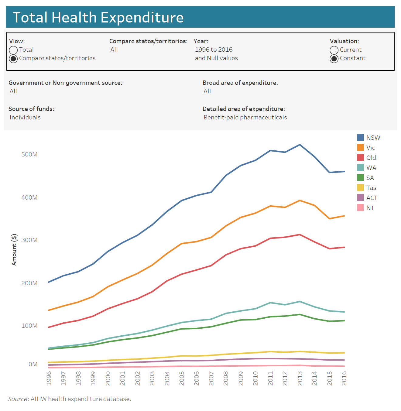
There are 3 chart options: Total Health Expenditure (HE), Recurrent HE by Source of Funds and Recurrent HE by Area of Expenditure.

The Total HE option, as shown below, is limited to a comparison of fund source and area of expenditure by States/Territories.

Source of funds choices are Government (Australian or State/Territory and local) or non-Government (Health insurance, individuals or other).

Each of the five broad area of expenditures can be presented by (detailed areas of expenditure):

  1. Hospitals (Private or Public hospital services)
  2. Other services (Administration, Aids and appliances, Patient transport services)
  3. Primary health care (All other medications, Benefit-paid pharmaceuticals, Community health & other, Dental services, Other health practitioners, Public health, Unreferred medical services)
  4. Referred medical services
  5. Research

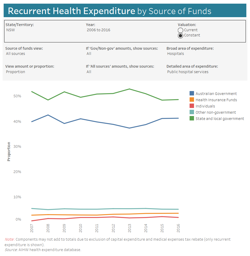
HE on Public Hospital services by the source of funds for NSW is shown above. Although the contribution of Private Health Insurance (PHI) as a proportion rose over 15% from 2012/13 (3.02%) to 2016/17 (3.48%), it is difficult to detect graphically as it is overwhelmed by the Government sources. Nationally, over the same period the proportion increased by approximately 9%.

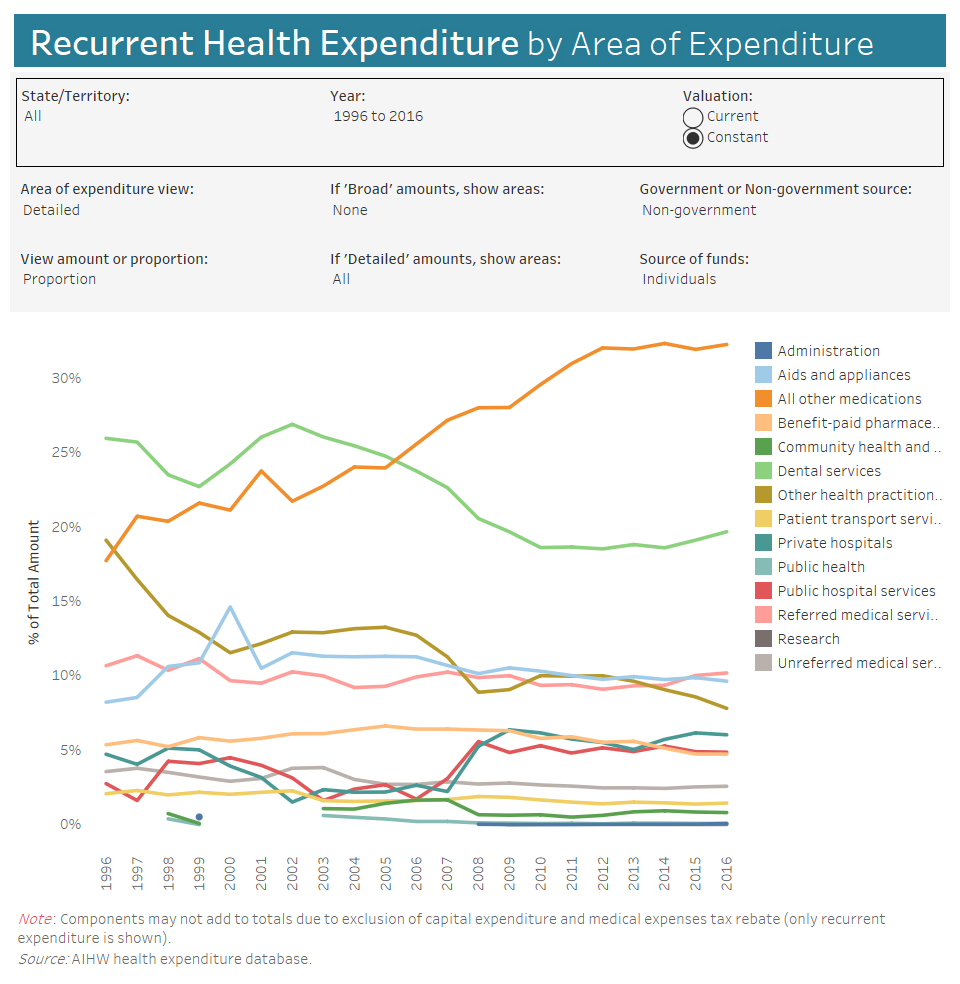
Finally, HE by Area of Expenditure (above) provides a clear picture of the move of medication costs from Government to individuals over the past decade. Unfortunately, the variable labels continued to be truncated when the graph image was downloaded.

Overall, the data visualisation tool is a useful addition to the reporting of information by the AIHW.

Picture source and worth a read: https://www.mindjet.com/blog/2013/07/visualisation-rocks/

Additional article on data visualisations

A universal dental benefits scheme?

Dental health is an important component of personal well-being. Poor dental hygiene, apart from making unpleasant company, has been reported to be linked to higher rates of systemic disease. In an almost 40-year prospective cohort study of Swedish adults, Wilson and colleagues (2018) concluded that poor oral health is associated with a slightly increased risk of myocardial infarction. However, they caution that the results may partly be explained by residual confounding, in particular to tobacco smoking.

Closer to home, the Australian Dental Association’s Oral Health Tracker (February 2018) makes for sobering reading with 15.5% of adults reported as having inadequate dentition (< 21 teeth); 25.5% with untreated tooth decay and only 51% brushing twice daily with fluoridated toothpaste. This last figure is 68.5% in children aged 5-14 years but even so, 23.5% of this age group have already experienced decay in their permanent teeth.

The most recent AIHW report on oral and dental care in Australia notes that total expenditure on dental services (except those in hospitals) was $8.7 billion in 2012–13. This was an increase of approximately 46% (adjusted for inflation) over the decade from 2002-03. Assuming a similar growth rate, this figure may be, conservatively, around $11 billion in 2019-20.

Who pays for dental services?

In 2013, the largest source of funds for overall dental expenditure was individuals, paying directly out of pocket for 58% of total dental costs.


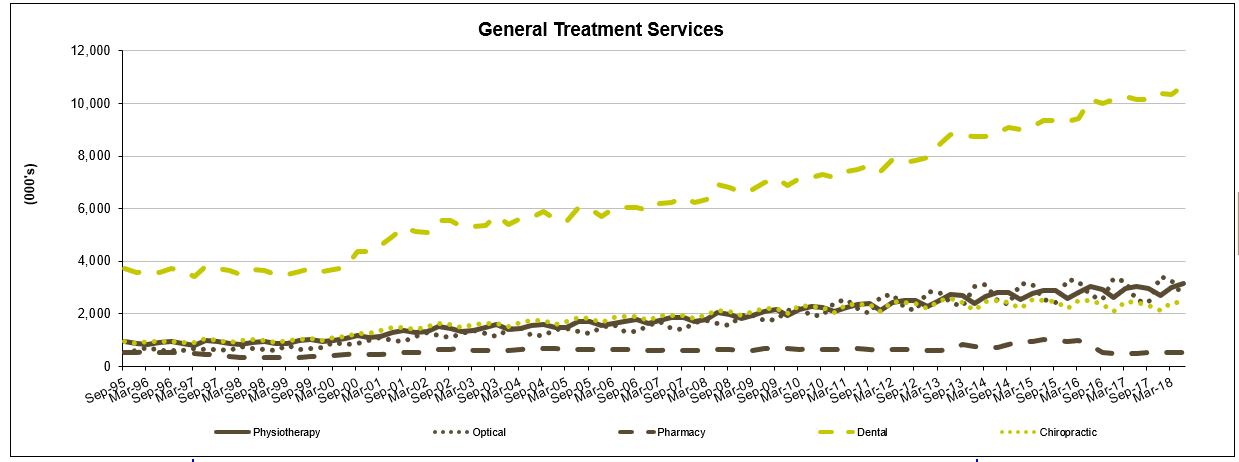
Of the 55% of Australians with dental coverage through their private health insurance, less than 10% of services were fully covered. The graph shows benefits paid for various extras services by private health insurers on a quarterly basis (APRA PHI Statistics). Dental services are clearly a pressure point and patient co-payments must be rising at a similar trajectory.

The Commonwealth Government can be said to contribute their part via the Private Health Insurance rebate (estimated to reach $6.5 billion by 2019-20). Additionally, a National Partnership Agreement on Dental services for Adults will provide approximately $316 million dollars to the States/Territories under the medical services sub-function for the same period. This infers that the States/Territories currently fund the bulk of public dental services.

A Child Dental Benefits Schedule (CDBS) was introduced by the Federal Government in 2014 for children aged between 2-17 years whose family receives Family Tax Benefit Part A or a relevant Australian Government payment. Interestingly, in the 2018-19 Budget, expenses for dental services are forecast to decrease by 7.0 per cent in real terms over the period 2018-19 to 2021-22, reflecting lower growth in utilisation of the CDBS. Potentially, this is a result of ongoing changes to the scheme, up to version 7.0 as at 1 January 2018.

The Australian healthcare system is acknowledged for its universality, structured around the 3 pillars of public hospitals, Medicare and the Pharmaceutical Benefits Scheme (PBS). A fourth, the National Disability Insurance Scheme (NDIS) is being established. By 2019-20, these will represent 4 of the top 8 program spends for the Commonwealth Government, budgeted at $22.3, $25.5, $11.7 and $20.7 billion, respectively.

In such an environment, the fact that 30% of Australians currently go without regular dental care due to cost, unavailability of services and other barriers, seems like a blind spot.  If dental health is a general indicator of personal health care practices, establishing good routines early in life may contribute to better overall population health. Isn’t that worth paying for?

The Final Report of the National Advisory Council on Dental Health (2012), established by the then Minister for Health and Ageing, the Hon Nicola Roxon MP and Senator Richard Di Natale, to answer this exact question, definitely thinks so. Dental policy options to achieve universal access are detailed and waiting…

Source: Cartoon, Donkey, from the Shrek movies.

Linking cancer screening & outcomes data

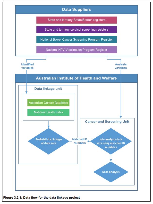
The Australian Institute of Health and Welfare (AIHW) has reported for the first time linkage and analysis of data by their Data Linkage Unit from the following six sources:

• BreastScreen Australia registers from the 8 states & territories;
• National Cervical Screening Program  registers from each state/territory;
• the National Bowel Cancer Screening Program Register;
• the Australian Cancer Database;
• the National Death Index; and
• the National HPV (human papillomavirus) Vaccination Program Register.

Privacy was protected as no one person had access to both the identified data and analysis variables. Data linkage was carried out in a step-wise fashion using identifying variables names, sex, date of birth and postcode. Probabilistic data linkage based on the method developed by Fellegi and Sunter (1969) was used.

Retrospective cohort studies were undertaken for breast, cervical and bowel cancer to assess survival for screen-detected compared with non-screen-detected cancers.

Breast cancers were identified on the Australian Cancer Database by ICD-10 code (C50) with date of diagnosis between 1 January 2002 and 31 December 2012 inclusive, for women aged 50–69 at diagnosis. These were linked with available data from BreastScreen registers (from 1 January 2000), and the screening history prior to each cancer used to assign a screening status to each breast cancer. These were: screen-detected cancers; non-screen-detected cancers in screened women;  interval cancers; non-screen-detected cancers in never-screened women. These individuals were then linked with data from the National Death Index to ascertain date of death and cause of death for those who had died by 31 December 2015.

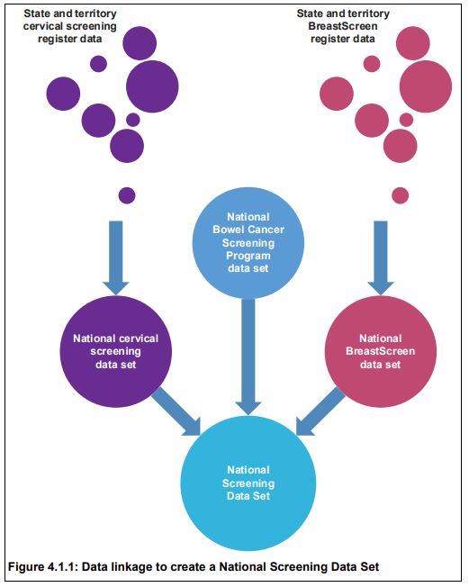
Similar processes were undertaken for cervical and bowel cancers to create a National Screening Data Set. National identification numbers provided by the AIHW Data Linkage Unit to the AIHW Cancer and Screening Unit allowed the formation of a de-identified national cancer screening data set for analysis.

The Australian Cancer Database was linked to the National Screening Data Set using an outer join, meaning that all data from both data sets were retained in the final data set, which then comprised all screened individuals irrespective of whether they were diagnosed with a cancer, and all individuals diagnosed with a cancer irrespective of whether they were screened. This was important to ensure that breast, cervical and bowel cancers that were not detected through screening could contribute to the analyses, and that screening behaviour related to prior cancer diagnosis of any cancer type could be assessed.

Linkage with the National Death Index was the last step in the data linkage process. After linkage, there were 15,238,666 unique individuals in the project. The majority (61.7%) of individuals in the data linkage project had only one type of event (that is, appeared in only one of the data sources), while 24.6% experienced 2 event types, and 12.4% experienced 3 event types.

Three individuals experienced all 6 event types in the project, meaning that 3 individuals had a screening mammogram through BreastScreen, had a cervical cytology, histology or HPV test, were invited to the bowel screening program, were diagnosed with cancer, received at least 1 dose of HPV vaccine, and had died.

Breast cancer
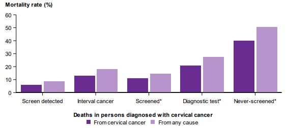
There were 73,440 breast cancers diagnosed in the cohort selected for survival analyses (women aged 50–69 diagnosed 1 January 2002 to 31 December 2012). Women diagnosed with screen-detected breast cancers were less likely to die, and those who did die were less likely to die from breast cancer than women whose breast cancer was not screen-detected, with 50.5% of deaths in women with screen-detected breast cancer due to breast cancer, compared with 74.2% in never-screened women.

Cervical cancer 
There were 6,897 cervical cancers diagnosed in the cohort selected for survival analyses (women aged 20–69 diagnosed 1 January 2002 to 31 December 2012). Women diagnosed with screen-detected cervical cancers were less likely to die, and those who did die were less likely to die from cervical cancer than women whose cervical cancer was not screen-detected, with 67.7% of deaths in women with screen-detected cervical cancer due to cervical cancer, compared with 78.7% in never-screened women.

Never-screened women diagnosed with cervical cancer had the highest risk of cervical cancer mortality. The unadjusted hazard ratio for cervical cancer mortality for women diagnosed with cervical cancer was 0.11, i.e. 89% less chance of dying of cervical cancer than a never screened woman. All cause mortality was also statically significantly lower.

Bowel cancer 
There were 31,427 bowel cancers diagnosed in the cohort selected for survival analyses (people aged 50–69 diagnosed 1 August 2006 to 31 December 2012). Of the diagnosed bowel cancers, 3,316 (10.6%) were screen-detected. The relatively low proportion is due to the need to be invited to have a bowel cancer detected through the screening program (previously limited to those turning 50, 55 or 65). The proportion of bowel cancers that are screen-detected is expected to increase with the introduction of biennial screening for all Australians aged 50–74 from the year 2019 (see previous post). People diagnosed with screen-detected bowel cancers were less likely to die, and those who did die were less likely to die from bowel cancer than people whose bowel cancer was not screen-detected, with 65.8% of deaths in people diagnosed with a screen-detected bowel cancer due to bowel cancer, compared with 78.1% in people never-invited to screen.

Further publications from the project are to follow. This first report clearly shows the value of data linkage, and overwhelmingly, the public health benefit of both Government subsidised screening programs and of participating in them!

Private Health Insurance in Australia

The foundations of the modern Australian Healthcare System are three publicly-financed programmes:  Medicare, Pharmaceutical Benefits Scheme & Public Hospitals. However, private health services are an increasingly critical piece of the infrastructure, with approximately 40% of hospital admissions during 2016/17 occurring in the private system. Although not mandatory, such services can be funded through private health insurance (PHI).

The benefits of PHI include choice of doctor, assistance with the cost of treatment in a private hospital, and the cost of ancillary treatments not covered by Medicare such as dental, optical and physiotherapy. The median waiting time for elective surgery for privately insured patients has been reported to be approximately half that of public patients, at 20 and 42 days, respectively.

The PHI policies currently on offer contain a bewildering combination of benefits, co-payments, exclusions and restrictions depending upon the premium paid. Ambulance transport is usually covered, importantly as a trip may be free in some states/territories of Australia but only for ‘medically necessary’ journeys in others, or not at all.

A recent Choice review looked at free online insurance comparison websites purporting to assist consumers to select the most appropriate policy. They found that ‘free’ comparison sites may actually earn fees that make up a sizeable proportion of total premiums. Some sites only compared  part of the market, while others were owned by the insurance companies they were comparing!

Membership woes

In June 1974, around the time of introduction of universal healthcare, a peak of 78.4% of the Australian population held private hospital insurance cover. At the end of June 2018, this figure was 45.1%, with 54.3% holding ancillary/extras or general cover (ambulance at a minimum). The policy trials and tribulations of maintaining private hospital cover levels are clearly shown in the graph.

Source: APRA Quarterly PHI Statistics 

The 2011 National Health Reform Agreement allowed patients with private hospital insurance entering a public hospital to choose whether to be admitted as a public or private patient. This led to an increase in the proportion of public hospital activity funded through private health insurance. Data shows that while 1 in 12 admissions to a public hospital in 2006–07 were under PHI, this figure increased to 1 in 7 during 2015–16 (AIHW 2017) suggesting that public hospitals were encouraging patients to use their private cover. Subsequently, negatively impacting the cost of PHI premiums and public hospital waiting lists.

As policy holders uptake of medical services and the cost of treatments and procedures both rise, premium affordability is becoming an issue. The trend is away from PHI membership as premiums continue to increase year-on-year at twice the rate of  inflation in an environment of low wage growth. Younger members, who are less likely to claim, are dropping cover (refer graph) leading to the question being asked: how can PHI funds be sustainable and afford to pay (ageing) members’ claims into the future?

Further Policy Reform

In October 2017, the Government announced a significant reform package, aimed at addressing some of the issues described. Successful implementation and adoption of these reforms will be essential to maintain the existing levels of service provided by the healthcare system.


For more detail, see the Parliamentary Library’s ‘Private Health Insurance: a quick guide’ by Amanda Biggs, Social Policy Section (Research Paper Series, 2017–18, 4 August 2017)

Meme source: King Julian Madagascar