Health Data Snapshot, Part 3

A treasure trove of health data by location is available on-line. 

HealthStats NSW contains up-to-date information on over 200 health risk factors, diseases, locations, and specific populations within New South Wales. The flexibility and power of this resource is reflected in the snapshot of Hospitalisations by category of cause.  The blurry graph shows a time-series comparison by Primary Health Network and all NSW for ‘blood and autoimmune disorders’.  The data table is a click away below, the top down menu shows the other therapeutic categories that can be selected. Behind the drop-down are further choices based upon demographics, Aboriginal and Torres Strait Islander (ATSI) background and/or socioeconomic status.

The National Diabetes Supply Scheme provides an on-line mapping tool of registrants by various geographical locations. This can also be filtered further by diabetes type, age, gender, ATSI and socioeconomic status. The example shown is for the Local Government Area of Campbelltown in NSW where the estimated prevalence of diabetes is 7.3% of the population, which is classified as very high comparative to the national average rate of 5.3%.


In addition to these interactive, web-based applications, reports collating specific data are starting to be published. Most recently, the AIHW released Potentially preventable hospitalisations in Australia by small geographic areas.  This report provides information on 22 chronic, acute and vaccine-preventable conditions for which hospitalisation may have been avoided by the provision of timely and appropriate health care. Even though these reports usually contain data already available publicly, it is often cross-tabbed to provide different perspectives, and the quality of an AIHW analysis is assured.


As the MyHealthyCommunities website is to national and localised primary healthcare data, then the MyHospitals website is to hospitals data. The site, established by the AIHW in 2010, includes data for over 1,000 public and private hospitals nationally. Hospitals can be searched for by state or postcode. Individual hospital profiles, services, and performance indicators can be viewed and compared to other hospitals. Information can be presented as a data table, such as the Waiting Time in Emergency Departments by hospital type shown (above), or graphically such as the financial efficiency data (activity based funding) presented for The Alfred, Melbourne (below). The site includes an explanatory videos and notes to assist in interpretation of information provided.

Graphic source: http://fchd.org/Clinic/CountyHealthData.aspx

Health Data Snapshot, Part 2

In Part 1, geographical classifications available for collation and reporting of health data were discussed.

The demographic characteristics of a population are generally presented before moving into health statistics. The ABS Census of Population and Housing Data includes this information and is available by geography online for the past 4 surveys (2016, 2011, 2006, 2001). The 2016 Census for ABS Statistical Area 3 for Woden Valley in Canberra, Australian Capital Territory (ACT), the location of the Department of Health is shown. ‘Quick Statistics’ provide a one page (scroll down) summary for the approximately 35,000 residents in a table format, and a side by side comparison of each variable to that recorded for the 400,000 inhabitants of the ACT, and just over 24 million people in Australia. While 68% of the residents of the Woden Valley were born in Australia, 25% speak a language other than English at home.

A ‘General Community Profile’ is also generated and consists of an Excel workbook containing 60 spreadsheets of data for the area selected. A range of other Census data products are also free online, including Time Series Profiles across Censuses, DataPacks and TableBuilders.

The 5-yearly Census of Population and Housing data is used to generate the Socio-Economic Indexes for Areas (SEIFAs) which, as the name implies, rank areas in Australia according to relative socio-economic advantage and disadvantage. Each of the four indexes is a summary of a different subset of Census variables with a different focus:

  • Index of Relative Socio-economic Disadvantage (IRSD)
  • Index of Relative Socio-economic Advantage and Disadvantage (IRSAD)
  • Index of Economic Resources (IER)
  • Index of Education and Occupation (IEO)

The website includes an interactive map for each index. If we enter Woden Valley ACT on the IRSD Interactive Map,  the SA3 geographic area is not available in the drop down menu. Our selection is limed to SA1, SA2, LGA, POA or SSC, however data cubes with results by decile are available for the wider range of geographic classifications.

Sixteen variables are used in the IRSD index. The percent of people with stated household equivalised income between $1 and $26,999 per year is the strongest indicator of disadvantage. Other associated factors include unemployment, lower levels of education attainment, no internet connection, no car, overcrowded private dwelling and poor English language skills.

Unfortunately, the indexes are not foolproof. Selection of geographic area can impact the results as shown for Woden Valley,  where choice of SA2 displays pockets of Quintile 1, most disadvantaged through to Quintiles 3, 4 and 5, least disadvantaged (on the left) suggesting a different socio-economic situation than when Local Government Area is selected with all areas being displayed as Quintile 5, least disadvantaged (on the right). This re-enforces the need to compare like with like to ensure appropriate interpretation.


Source Tom Cruise meme: Google images (unfortunately, the link goes to one of those surveys)

Health Data Snapshot, Part 1

If you want to create a picture of the health status and needs of the residents in a particular Australian location, the first step is to define the area you are interested in. This seems pretty straightforward, until you start pulling out numbers…

Thanks to the Australian Bureau of Statistics, who developed the Australian Statistical Geography Standard (ASGS) in 1984, using the latest version from 2011, you can find statistics from different sources that apply to the same area, and hence, are comparable.  The power of this will become evident in Part 2, and saves a lot of time!

The ASGS is split into two parts. The basis for both are the smallest geographical area defined by the ABS, known as Mesh Blocks (MBs). They are geographic building blocks that take into account factors like suburb boundaries and land use. Most Mesh Blocks contain 30 to 60 homes. Mesh Blocks are updated every 5 years to reflect changes, such as new housing developments.

ABS Structures

These are areas that the ABS designs specifically for generating statistics. They also stay stable for 5 years to enable better comparison of data over time.

Statistical Areas Level 1 (SA1s) have an average population of approximately 400 persons. They aim to separate out areas with different geographic characteristics within Suburb and Locality boundaries. SA1s are aggregations of Mesh Blocks.

Statistical Area Level 2 (SA2s) reflect functional areas that represent a community that interacts together socially and economically. SA2s generally have an average population of about 10,000 persons. SA2s are aggregations of whole SA1s.

Statistical Areas Level 3 (SA3s) are designed for the output of regional data and generally have populations between 30,000 and 130,000 persons. SA3s are aggregations of whole SA2s.

Other classifications include SA4s for Labour Force Surveys; State and Territory and Australia for geographical purposes; and specific structures for Indigenous and Remoteness.


Non ABS Structures

As  the title would suggest, these are not defined by the ABS, however they are required to report statistics on them. These measures probably annoy purists within the ABS as they change regularly. For example, Local Government Areas (LGAs) are defined by State and Territory governments and updated annually. The diagram shows the eight Non-ABS structures that generally represent administrative regions and how the ABS approximates them using a construction of Mesh Blocks, SA1s or SA2s.

Diagram 2 depicts the various ASGS Non-ABS Strutcures, their component regions and how they interrelate.

In addition to Local Government Areas (LGAs), these include: Postal Areas (POAs); State Suburbs (SSCs); State Electoral Divisions (SEDs); and Commonwealth Electoral Divisions (CEDs), the later using the Australian Electoral Commission (AEC) federal electoral division boundaries constructed from allocations of one or more whole SA1s.

Non Non-ABS Structures

One to date: Primary Health Networks (PHN).

In Part 2, where and when to put these structures to use locating health data.

Visit the ABS website for further details. Photo source

Gut wrenching data

The newly released AIHW Report on Gastrointestinal Cancers is the first time Australia-wide data, specific to gastrointestinal-tract cancers, has been collated. It is the result of collaboration between the AIHW, all state and territory population-based cancer registries and Cancer Australia.

The report is a fantastic resource as it brings together epidemiological, diagnostic and treatment data in a comprehensive way thus providing a full picture for comparison and interpretation. The explanations regarding data sources in the appendices are also very helpful.

The eight upper and lower gastro-intestinal cancers included are shown in the graph below of cases diagnosed, deaths and relative 5-year survival rates.  Colorectal cancer is the most commonly diagnosed, a function of higher incidence and the National Bowel Cancer Screening Program (NBCSP), followed by pancreatic cancer as the second most commonly diagnosed.  These two cancer types are associated with the highest and lowest, 5-year relative survival rates of all gastrointestinal-tract cancers, at 69% and 9%, respectively.


The inclusion of disease Stage at diagnosis enables presentation of data as shown below from the report. Cases of colorectal cancer diagnosed in 2011 and the 5-year relative survival for the period 2011-2016, both reported by disease Stage, clearly demonstrate the impact of early diagnosis on mortality. For people diagnosed with Stage I colorectal cancer, the 5-year survival rate was 99%. Delay diagnosis to Stage IV and this figure becomes 13%.


In 2016–17, the gastrointestinal-tract accounted for approximately 20% of cancer diagnoses, 18% of cancer-related hospitalisations and 27% of chemotherapy procedures in Australia. Further detail on the treatment used at which disease Stage, would be a valuable inclusion in the next iteration of this report.

The majority (92%) of the burden of gastrointestinal-tract cancer was due to premature death. The remainder was associated with diagnosis (such as  biopsy) and primary treatment of the cancer (for example, surgery which may include bowel resection). Long-term effects, such as the use of a stoma with a colostomy bag, also contributes to the non-fatal burden from colorectal cancer in the Australian population.

Picture source: ‘The Scream’ original and stylised

Visualisation of Health Expenditure data

The Australian Institute of Health and Welfare (AIHW) report on national health expenditure for the financial year 2016-17 was released last week. The usual on-line and pdf versions are available and the information can also be viewed using a data visualisation tool.

The tool accesses the AIHW Expenditure Database from 1996 through to 2016. Note: these years refer to financial years (the full year covered appears when the cursor is hovered over a data point on graphs produced).

The choice of presentation in constant or current dollars is important when assessing trends. Current prices are the actual amounts spent in the specified year. These will match the dollar amounts in the published reports, however they are not adjusted for inflation. Any comparisons made over different time periods require the use of constant prices that have been ‘deflated’ to a selected reference year. The tool uses the most recent data presented as the reference year. Growth in expenditure when expressed in constant prices is termed ‘real growth’ as opposed to ‘nominal growth’ when current prices are used.

There are 3 chart options: Total Health Expenditure (HE), Recurrent HE by Source of Funds and Recurrent HE by Area of Expenditure.

The Total HE option, as shown below, is limited to a comparison of fund source and area of expenditure by States/Territories.

Source of funds choices are Government (Australian or State/Territory and local) or non-Government (Health insurance, individuals or other).

Each of the five broad area of expenditures can be presented by (detailed areas of expenditure):

  1. Hospitals (Private or Public hospital services)
  2. Other services (Administration, Aids and appliances, Patient transport services)
  3. Primary health care (All other medications, Benefit-paid pharmaceuticals, Community health & other, Dental services, Other health practitioners, Public health, Unreferred medical services)
  4. Referred medical services
  5. Research

HE on Public Hospital services by the source of funds for NSW is shown above. Although the contribution of Private Health Insurance (PHI) as a proportion rose over 15% from 2012/13 (3.02%) to 2016/17 (3.48%), it is difficult to detect graphically as it is overwhelmed by the Government sources. Nationally, over the same period the proportion increased by approximately 9%.

Finally, HE by Area of Expenditure (above) provides a clear picture of the move of medication costs from Government to individuals over the past decade. Unfortunately, the variable labels continued to be truncated when the graph image was downloaded.

Overall, the data visualisation tool is a useful addition to the reporting of information by the AIHW.

Picture source and worth a read: https://www.mindjet.com/blog/2013/07/visualisation-rocks/

Additional article on data visualisations

Linking cancer screening & outcomes data

The Australian Institute of Health and Welfare (AIHW) has reported for the first time linkage and analysis of data by their Data Linkage Unit from the following six sources:

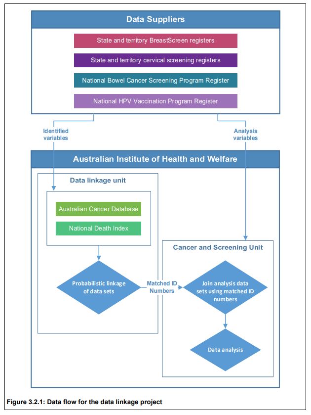
• BreastScreen Australia registers from the 8 states & territories;
• National Cervical Screening Program  registers from each state/territory;
• the National Bowel Cancer Screening Program Register;
• the Australian Cancer Database;
• the National Death Index; and
• the National HPV (human papillomavirus) Vaccination Program Register.

Privacy was protected as no one person had access to both the identified data and analysis variables. Data linkage was carried out in a step-wise fashion using identifying variables names, sex, date of birth and postcode. Probabilistic data linkage based on the method developed by Fellegi and Sunter (1969) was used.

Retrospective cohort studies were undertaken for breast, cervical and bowel cancer to assess survival for screen-detected compared with non-screen-detected cancers.

Breast cancers were identified on the Australian Cancer Database by ICD-10 code (C50) with date of diagnosis between 1 January 2002 and 31 December 2012 inclusive, for women aged 50–69 at diagnosis. These were linked with available data from BreastScreen registers (from 1 January 2000), and the screening history prior to each cancer used to assign a screening status to each breast cancer. These were: screen-detected cancers; non-screen-detected cancers in screened women;  interval cancers; non-screen-detected cancers in never-screened women. These individuals were then linked with data from the National Death Index to ascertain date of death and cause of death for those who had died by 31 December 2015.

Similar processes were undertaken for cervical and bowel cancers to create a National Screening Data Set. National identification numbers provided by the AIHW Data Linkage Unit to the AIHW Cancer and Screening Unit allowed the formation of a de-identified national cancer screening data set for analysis.

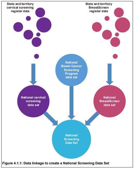
The Australian Cancer Database was linked to the National Screening Data Set using an outer join, meaning that all data from both data sets were retained in the final data set, which then comprised all screened individuals irrespective of whether they were diagnosed with a cancer, and all individuals diagnosed with a cancer irrespective of whether they were screened. This was important to ensure that breast, cervical and bowel cancers that were not detected through screening could contribute to the analyses, and that screening behaviour related to prior cancer diagnosis of any cancer type could be assessed.

Linkage with the National Death Index was the last step in the data linkage process. After linkage, there were 15,238,666 unique individuals in the project. The majority (61.7%) of individuals in the data linkage project had only one type of event (that is, appeared in only one of the data sources), while 24.6% experienced 2 event types, and 12.4% experienced 3 event types.

Three individuals experienced all 6 event types in the project, meaning that 3 individuals had a screening mammogram through BreastScreen, had a cervical cytology, histology or HPV test, were invited to the bowel screening program, were diagnosed with cancer, received at least 1 dose of HPV vaccine, and had died.

Breast cancer
There were 73,440 breast cancers diagnosed in the cohort selected for survival analyses (women aged 50–69 diagnosed 1 January 2002 to 31 December 2012). Women diagnosed with screen-detected breast cancers were less likely to die, and those who did die were less likely to die from breast cancer than women whose breast cancer was not screen-detected, with 50.5% of deaths in women with screen-detected breast cancer due to breast cancer, compared with 74.2% in never-screened women.

Cervical cancer 
There were 6,897 cervical cancers diagnosed in the cohort selected for survival analyses (women aged 20–69 diagnosed 1 January 2002 to 31 December 2012). Women diagnosed with screen-detected cervical cancers were less likely to die, and those who did die were less likely to die from cervical cancer than women whose cervical cancer was not screen-detected, with 67.7% of deaths in women with screen-detected cervical cancer due to cervical cancer, compared with 78.7% in never-screened women.

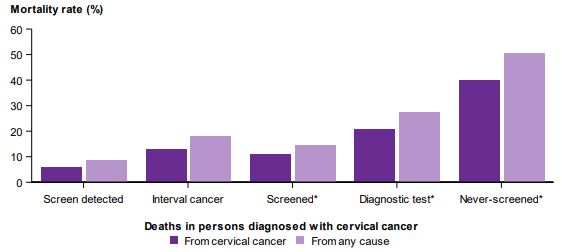
Never-screened women diagnosed with cervical cancer had the highest risk of cervical cancer mortality. The unadjusted hazard ratio for cervical cancer mortality for women diagnosed with cervical cancer was 0.11, i.e. 89% less chance of dying of cervical cancer than a never screened woman. All cause mortality was also statically significantly lower.

Bowel cancer 
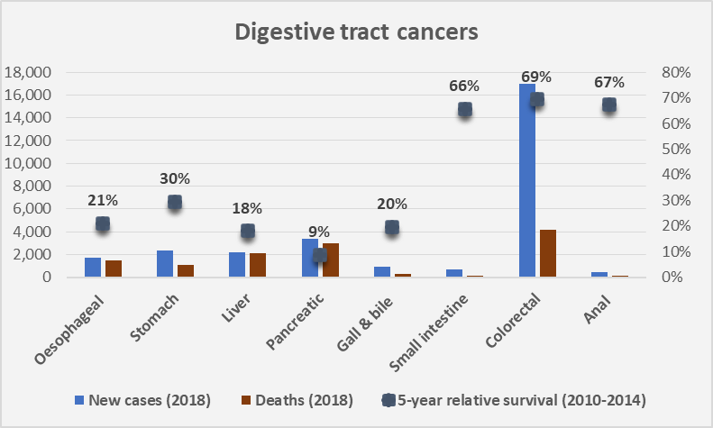
There were 31,427 bowel cancers diagnosed in the cohort selected for survival analyses (people aged 50–69 diagnosed 1 August 2006 to 31 December 2012). Of the diagnosed bowel cancers, 3,316 (10.6%) were screen-detected. The relatively low proportion is due to the need to be invited to have a bowel cancer detected through the screening program (previously limited to those turning 50, 55 or 65). The proportion of bowel cancers that are screen-detected is expected to increase with the introduction of biennial screening for all Australians aged 50–74 from the year 2019 (see previous post). People diagnosed with screen-detected bowel cancers were less likely to die, and those who did die were less likely to die from bowel cancer than people whose bowel cancer was not screen-detected, with 65.8% of deaths in people diagnosed with a screen-detected bowel cancer due to bowel cancer, compared with 78.1% in people never-invited to screen.

Further publications from the project are to follow. This first report clearly shows the value of data linkage, and overwhelmingly, the public health benefit of both Government subsidised screening programs and of participating in them!

Under PBS co-payment data

The Fifth Community Pharmacy Agreement (5CPA) contained a clause requiring community pharmacies to provide data to the Commonwealth on each PBS prescription dispensed at a price below the general patient co-payment. This was $35.40 when collection began on 1 April 2012 following enactment of the National Health Amendment (PBS) Act 2010. Prior to this date, PBS prescription data was only collected when a Government subsidy applied, reflecting the original purpose of the system.

The collection of data on use of PBS medicines by the Australian population has become an important secondary function. The combined impact of an increasing general co-payment amount (linked to CPI) and decreasing manufacture prices (price disclosure once off patent, no CPI), mean that a high proportion of medicines listed on the PBS are now priced below the general patient co-payment.

Given that such medicines include many commonly prescribed antibiotics, as well as medicines and other items associated with management and treatment of chronic diseases, it is important to fill this information gap. The Department of Health engaged KPMG to conduct a Combined Thematic Review of Access, Consumer Experience and Quality Use of Medicines under the 5CPA. The March 2015 Final Report did find that the initiative supported this aim. The data is collected from public and private hospitals and 99% of community pharmacies. It provides a tool for health policy planning, research, pharmacovigilance, monitoring risk management protocols and quality use of medicines in the community. The additional data has also been used to improve the accuracy of information available to the Pharmaceutical Benefits Advisory Committee (PBAC), among other decision makers.


The number of under co-payment Section 85 prescriptions dispensed on the PBS from 2012-13 through to 2016-17 are shown in the graph. The volume is increasing, however of more interest is the under co-payment prescriptions as a proportion of total PBS S85 prescriptions dispensed shown by the orange line. This was 24% in 2012-13 and increased to over 30% in 4 years.

Almost one third of S85 PBS prescriptions dispensed in Australia during 2016-17 were under co-payment and paid for by patients (out-of-pocket). Clearly medicines are affordable or the PBS is not the universal scheme it is generally stated to be.

Other gaps continue to exist in medicine usage data, for example, for medicines down-scheduled off the PBS to over-the-counter availability.


Sources: PBS statistics and Expenditure reports (www.pbs.gov.au); The Simpsons.

Primary healthcare (PHN) data

MyHealthyCommunities is an Australian Government website managed by the Australian Institute of Health and Welfare (AIHW). The public availability of statistics and data at a local Primary Health Network (PHN) is meant to drive improvements, increase transparency and accountability within the health system.

Data for more than 140 measures by PHN area are updated regularly. The categories, shown below, align with health priorities.

Interactive tools allow you to filter on characteristics, time period and location. Available data can be downloaded as maps or as an Excel spreadsheet.

A recent report on Out of Pocket spending on Medicare services in 2016-17 quantified what we all know from our trips to the GP or specialist with half of all patients (10.9 million people) incurring out-of-pocket (OOP) costs for non-hospital Medicare services last financial year. OOP were paid by:

  • 34% of patients who had a GP service,
  • 72% of patients attending a specialist appointment,
  • 23% of patients had costs for diagnostic imaging services,
  • 44% of patients requiring obstetric services.

The data and user friendly graphics are easily accessible. In addition to the 31 PRNs, results are presented for smaller local areas, known as SA3s, of which there are approximately 300. Have a look at the Excel download to get an appreciation of the depth of the data. Below is the landing screen for  the new interactive web tool which allows you to see variation across similar local areas by remoteness and socioeconomic status.

Another great initiative well executed by the AIHW.

Australian Public Hospitals and Activity-Based Funding

The National Health Reform Agreement (NHRA), signed by the Commonwealth Government and all states and territories in August 2011, committed to paying for public hospital expenditure, where practicable, using Activity-Based Funding (ABF), also known as Case mix or Episode-based funding.

ABF supports hospitals on the basis of the number, type and mix of patients treated. To ensure that payments are fair and equitable across public, private or not-for-profit providers of public hospital services, they are based on the same price for the same service.

Setting this price is the role of the Independent Hospital Pricing Authority (IHPA), established by the Commonwealth per Section B3 of the NHRA. Each year a National Efficient Price (NEP) is determined and used to calculate Commonwealth funding for public hospital services, and also to benchmark the efficient cost of providing those services.

The NEP is based on the average cost of an admitted acute episode of care provided in public
hospitals during a financial year. Each episode of patient care is allocated a National Weighted Activity Unit (NWAU). The episodes of acute care are coded using the Australian-Refined Diagnosis-Related Groups (AR-DRGs) classification system.

The NWAU is a measure of hospital activity expressed as a common unit. The ‘average’ hospital service is worth one NWAU. The price of each public hospital service is calculated by multiplying the NWAU allocated to that service by the NEP. The NEP for 2018-19 is $5,012 per NWAU.

The National Hospital Cost Data Collection (NHCDC) tabulates cost weights*, total number of separations, average length of stay and direct and indirect costs by AR-DRG. The most recent report available is for Round 20 (2015-16). The AIHW provides principal diagnosis AR-DRG data cubes up to, and including, 2016-17, although these do not include cost weights.

As diagnosis is a major driver of in-patient hospital costs, ABF for admitted acute care services is based on DRGs. Other hospital services: non-admitted out-patient care; admitted sub-acute & non-acute care; emergency department care; admitted mental health care; and teaching, training & research are costed using other information.  Excel-based NWAU calculators are available for some of these service streams.

*Note: NHCDC Cost Weights and NWAU should be identical for the same service within the same time period.

Cartoon source: http://www.sauer-thompson.com/archives/opinion/health/ [14 July 2018]

Data from Australian Hospitals

The Australian Institute of Health and Welfare (AIHW) recently released a number of  reports providing statistics on Australian hospitals.

Australia’s hospitals 2016-17 at a glance provides an overview of public and private hospitals and services provided to the Australian community. Companion hospital statistics reports present further detail on Hospital resources 2016-17Admitted patient care 2016-17 and Non-admitted patient care 2016-17.

The information in the reports is based on data provided to the AIHW by state and territory health authorities for the National minimum data set (NMDS). As the name implies, a NMDS is a minimum set of data elements agreed for mandatory collection and reporting at a national level. As such, a NMDS is dependent on a national agreement to collect and supply uniform data. 

The National Health Information Agreement (NHIA) is that agreement. The current NHIA between the Australian Government and state/territory government health authorities commenced in October 2013.  Established to coordinate health information in Australia, including national data standards, the agreement also includes a commitment to co-operate through the Australian Health Ministers’ Advisory Council (AHMAC) which is the advisory body to the COAG Health Council.

The description of the characteristics of data is called ‘metadata’, often said to be ‘data about data’. By allowing those collecting and using data to have a common understanding of underlying features, metadata leads to better data. The repository for Australian national metadata standards for the health, community services and housing assistance sectors was developed by the AIHW and is known as METeOR.

AIHW’s National Hospitals Data Collection is comprised of six major databases with acronyms to match! One such national data set is the National Hospital Morbidity Database (NHMD) which is the collection of electronic, confidential summary records for admitted patients from public and private hospitals in Australia each financial year from 1993-94 and ongoing.

An excellent service is the public availability of interactive cubes of data from the National Hospital Morbidity Database. For example, the principal diagnosis cube (most recent 2015-16 to 2016-17) includes information on the number of same day and overnight separations (discharges), patient days and average length of stay, by age group and sex and year of separation, for each diagnosis. It can take some trial and error to produce the information you are after in a suitable format, but well worth the effort.